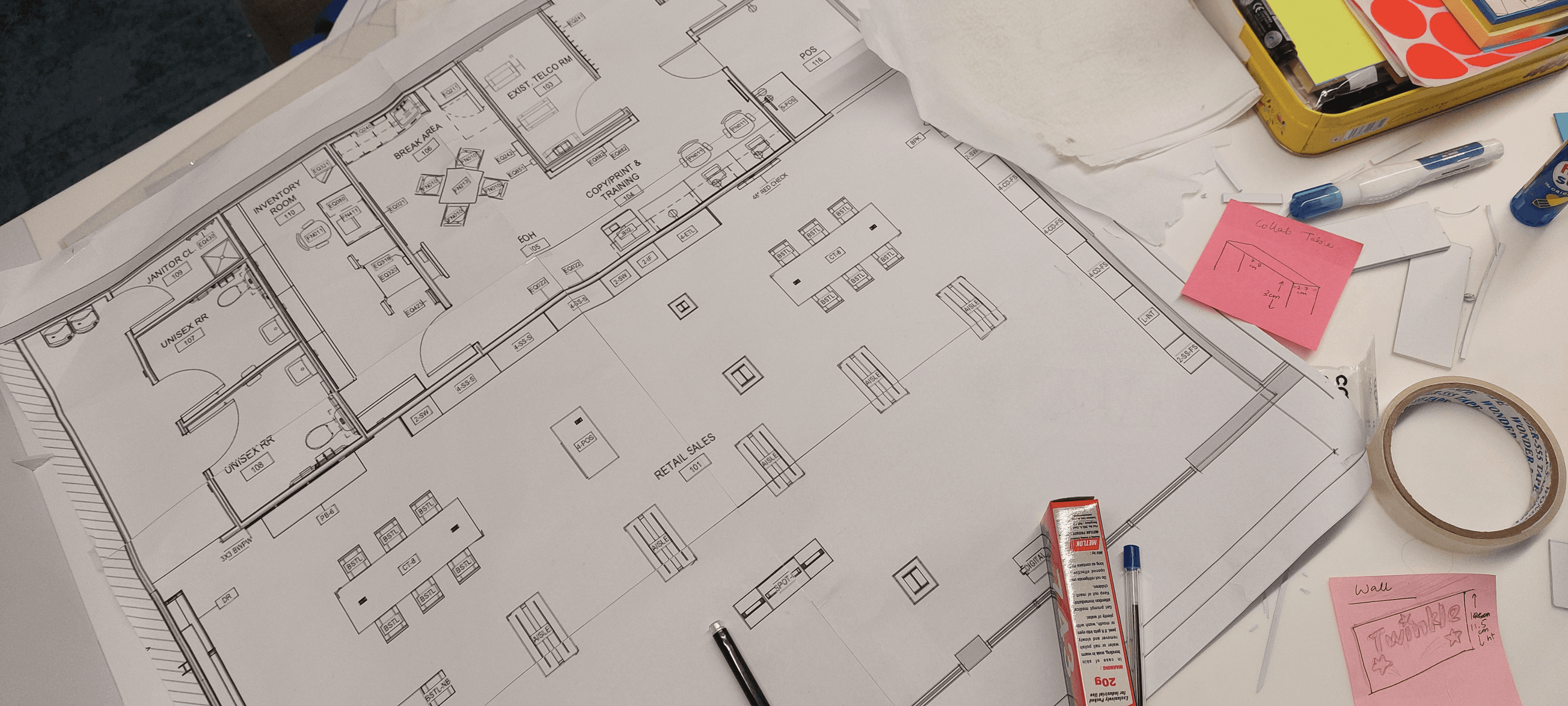
Actual architectural floor plan used during store research. Highlighted where the RC sits.
Verizon - Retail Companion & Personal Shopper
Industry
Retail UX/ AI
Client
Verizon
Service
UX/UI Design
Date
2024-25
Transforming the Verizon retail store into a collaborative, AI-powered plan-building experience for customers and store representatives using a 15' inch retail companion.
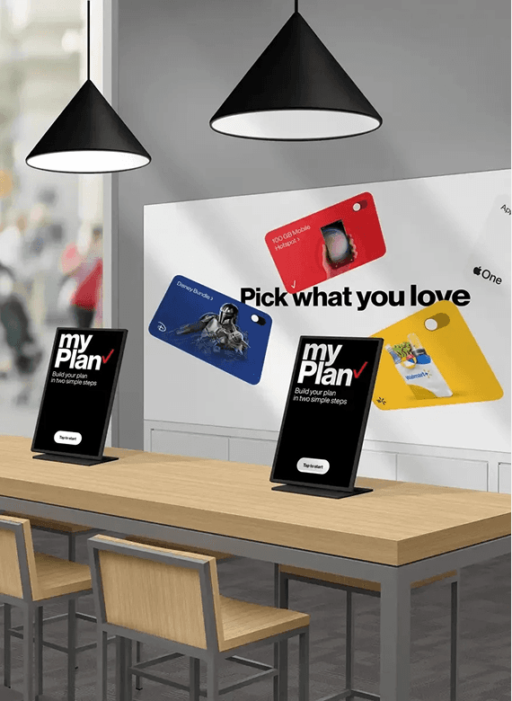
Transforming the Verizon retail store into a collaborative, AI-powered plan-building experience — a 15" touchscreen at the collaboration table, always live-synced to POS.
My Role
Lead UX Designer · Design Owner
Touchpoint
15" Vertical Kiosk + POS
Platform
Retail Companion (RC)
Client
Verizon

15" VERTICAL · IN-STORE
A touchscreen kiosk on the collaboration table inside every Verizon retail store — enabling real-time, collaborative plan-building between customers and store reps.
IN-STORE ECOSYSTEM
Every touchpoint — one connected experience.
RC doesn't sit alone. Understanding how it connects to every other touchpoint was essential before designing a single screen.
Primary
🖥️
Retail Companion
15" vertical portrait. Customer-facing. Rotates 180°. Centrepiece of the collaboration table.
📱
POS — Point of Sale
Rep's iPad. Admin controls, account data, transactions. Synced live with RC. Personal Shopper integrated here too.
📺
39" Ambient Display
Wall-mounted brand storytelling screen — part of the store's digital ecosystem.
🪑
Collaboration Table
Physical anchor of the RC experience. Side-by-side, not across a counter.
📲
My Verizon App
Post-visit changes made on RC reflect here. Customer's Verizon account is always synced.
🤝
Rep + Customer
RC is designed for both simultaneously — one screen serving two very different needs at the same time.
— 02 — STORE CONTEXT
Understanding the physical environment was essential. The collaboration table is the centerpiece of the store — and Retail Companion lives at its heart.
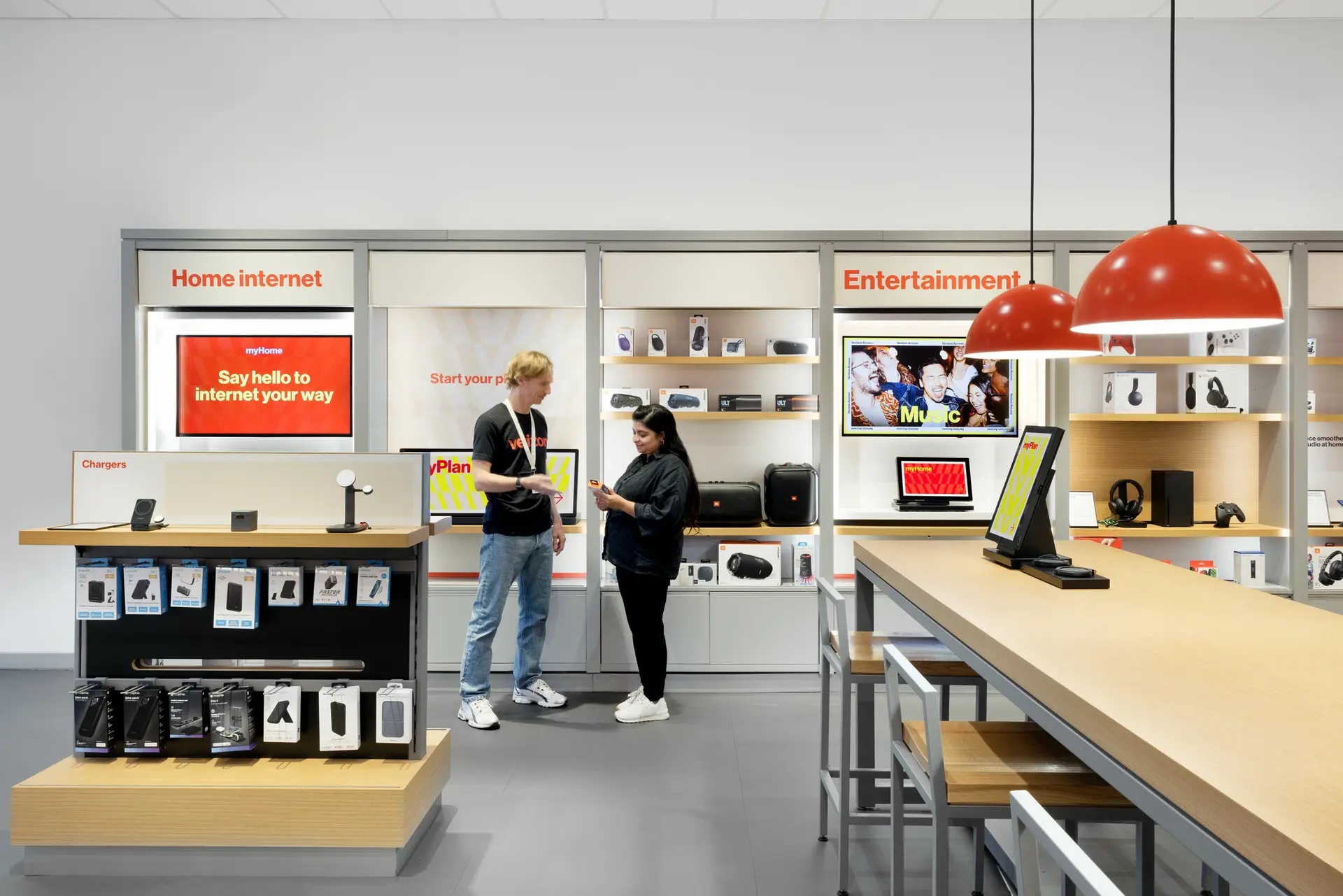
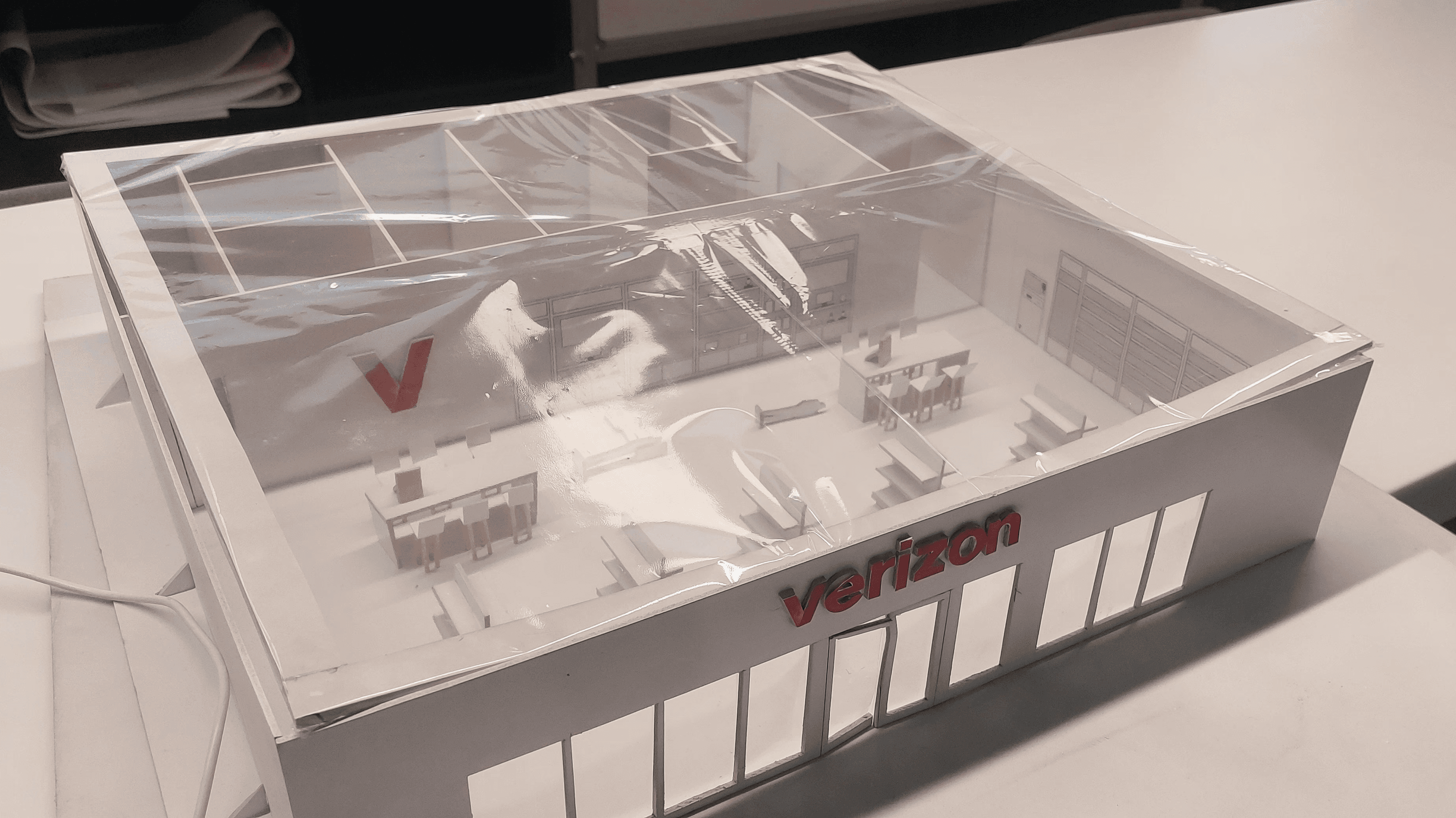

TOUCHPOINT PICTURES FROM ACTUAL STORE
NextGen store visits — NYC & Dallas.
In-person documentation from Bryant Park NYC, Lexington Ave NYC, and Grapevine Dallas TX.
Bryant Park & Lexington Ave NYC
Understanding the physical environment was essential. The collaboration table is the centerpiece of the store — and Retail Companion lives at its heart.
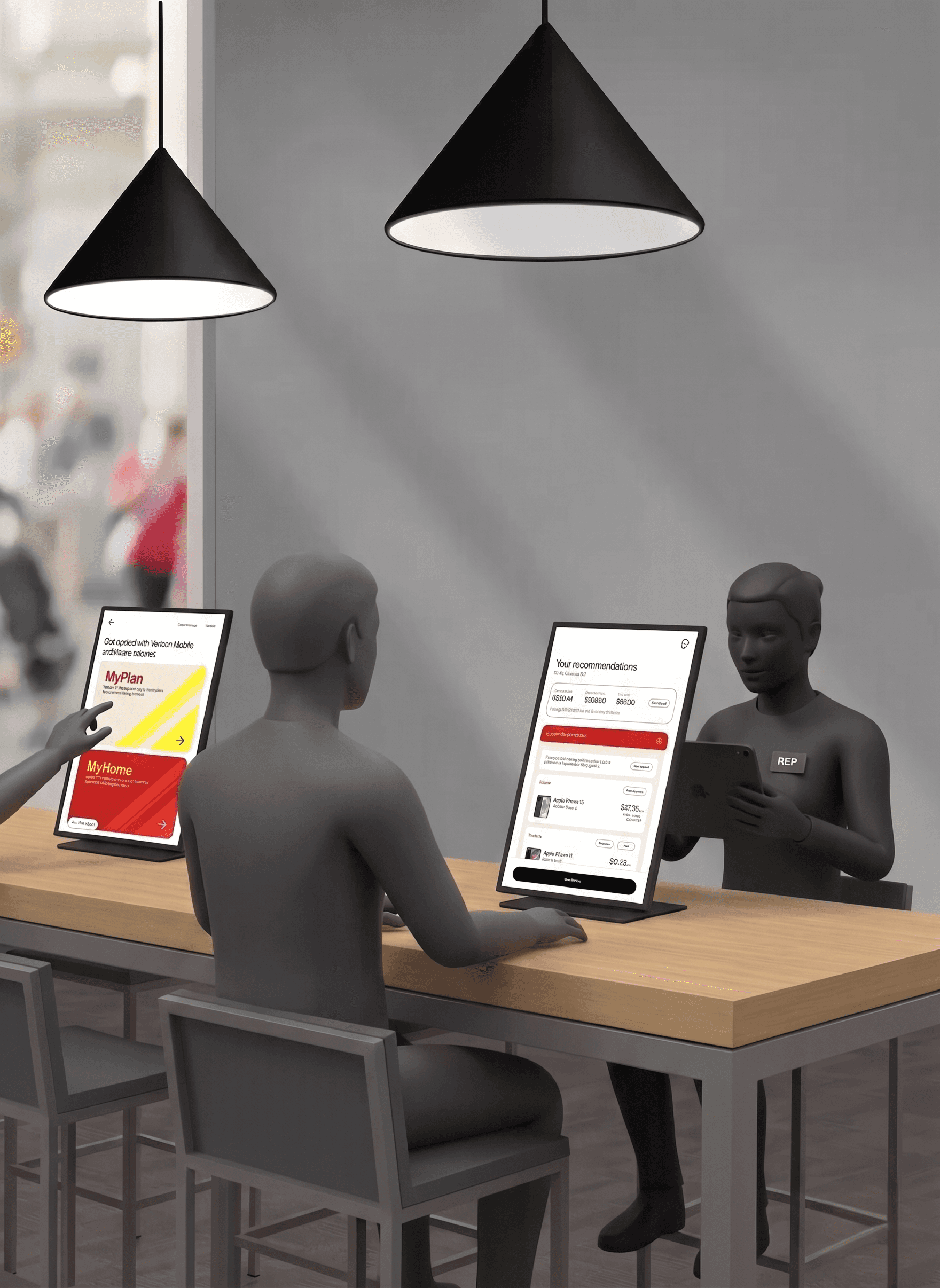
⟳ 180° Rotation
Retail companion in a Verizon store sitting on the collaboration table.
The usefulness of 180° rotation is that the customer gets full visibility and control of their plans, and the rep can set up the session or flip as and when required.
Customers can also use most of the non-login features on the Retail Companion independently.
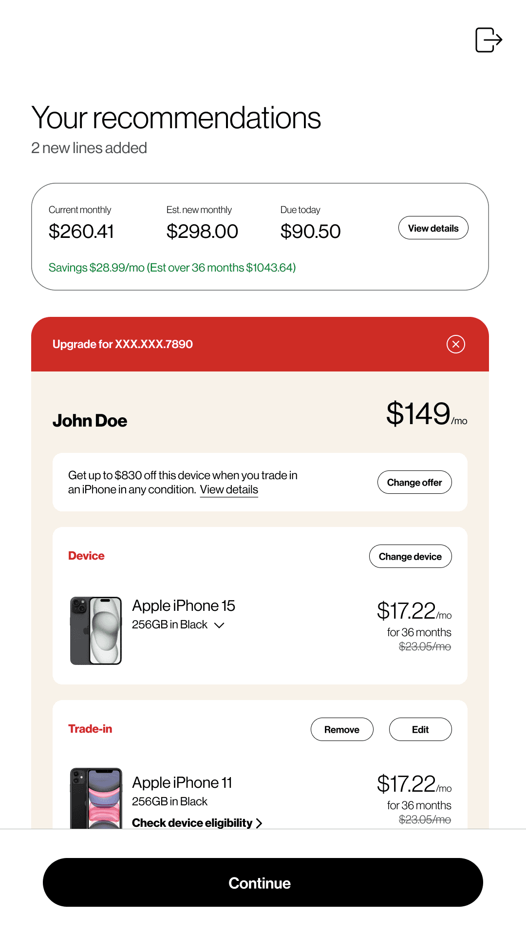

RC — 15" vertical portrait on the collaboration table


Screen Size
15" Vertical
Resolution
1080×1920
Rotation
Sync
Real-time POS
Key Constraint
The screen sits between rep and customer — not behind a counter. Every tap target, font size, and reading distance decision was driven by this physical setup.
— 04 — RESEARCH & DISCOVERY
Grounded in
the store
Understanding the physical environment was essential. The collaboration table is the centerpiece of the store — and Retail Companion lives at its heart.
🛒
Customers want guidance — not a pitch
68% of in-store visitors came for human guidance, but 54% reported feeling "sold to." RC needed to feel neutral and customer-controlled.
⏱️
Reps spend 40% of time switching screens
Toggling between POS, printed plan sheets, and verbal narration destroyed conversation flow. A shared live screen changed everything.
🤖
AI only trusted when contextual
Generic AI quotes triggered 72% negative sentiment. When recommendations cited actual usage and tenure, trust jumped 41 points.
📊
Transparency seeds better conversations
Showing customers their current plan data first increased session length 26% and improved upgrade acceptance significantly.
UXR Interview Q&A
Customer + Rep Sessions
Customers: Did the kiosk feel made for you or for the rep?
Most customers initially said it felt like a rep tool — information was dense and terminology unfamiliar. After the redesign, post-launch sessions showed a strong shift: customers described the screen as 'showing my stuff', feeling more like a mirror of their account than a sales terminal.
Customers: How did seeing your current plan change the conversation?
Customers who saw their current plan first were significantly more engaged — they asked more questions, challenged recommendations, and felt the conversation was grounded in their reality. The plan data acted as an anchor: 'Oh I'm paying that much? Tell me more about this upgrade.'
Customers: The device showed a "Personal Shopper" recommendation. Did it feel like genuine advice or a sales pitch? Why?
Early versions without rationale cards scored poorly — 'it just wants me to spend more.' Once we added the 'Why we recommend this' card referencing actual usage data and tenure, responses shifted dramatically. The transparent rationale was the single most impactful change.
Customers: Was there a moment you felt more — or less — in control?
Less in control: when the rep typed something and the screen changed without explanation. More in control: when they could tap through plans themselves, dismiss AI suggestions, or compare options side by side. This drove the decision to make RC independently explorable.
Reps: How has the collab table changed how you open conversations?
Reps consistently said they now lead with the screen rather than explaining verbally. 'I just show them their account and let them react' — this changed the dynamic from a pitch to a consultation.
Reps: When the AI Quote appears, how do you introduce it? Does the rationale card help or complicate your pitch?
Universally positive from reps — 'it does half my job.' The rationale card gave reps a defensible, data-backed talking point they could reference rather than making claims themselves. Feedback on timing fed directly into the logic for when Personal Shopper surfaces.
— 05 — DESIGN PROCESS
How I got from
brief to build.
Multi-sprint delivery in a consistent engagement, anchored in agile delivery with continuous research and validation loops.
- 01Discovery
Understand the ecosystem
Store visits across NYC and Dallas, rep shadowing, customer intercept interviews, existing system audit.
Store VisitsRep ShadowingStakeholder Interviews - 02Definition
Problem framing & strategy
Synthesised research into design principles. North star: "Customer-controlled, AI-augmented, rep-supported."
SynthesisDesign PrinciplesPO Alignment - 03Design
Wireframes → High Fidelity
Lo-fi flows to pixel-perfect Figma comps. Extended Verizon Design System into RDS for the 15" kiosk form factor.
WireframesVDS → RDSFigma HiFi - 04Validation
Prototype testing & iteration
Usability sessions with store staff and recruited customers. 4 iterations on AI Quote entry point alone.
Usability TestingA/B ConceptsIteration - 05Delivery
Dev handoff & VQA
Dev walkthrough sessions, component specs, edge case annotations. Led VQA on non-prod across multiple sprint releases.
Dev HandoffAnnotationsVQA

Full System Map
Mapping the RC experience before designing anything.
RC, POS, backend services, and all user flow intersections.
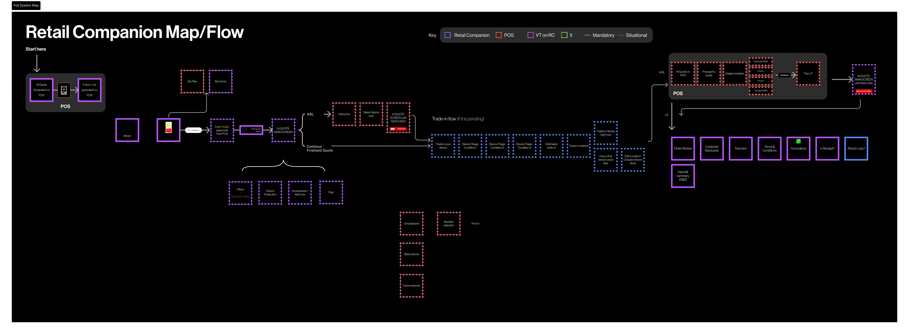
Full system map — RC touchpoints, POS connections, backend data flows, user journey intersections
Design Decisions
The tradeoffs that shaped the product.
Phase
Challenge
Decision
Impact
Discovery
Information Architecture
Existing IA was rep-centric. Customer account data buried 3 levels deep — reps narrated verbally.
Restructured IA around the customer journey. Admin functions moved to POS.
Design
AI Quote Framing
Early Personal Shopper felt like an upsell popup. Customers dismissed before reading.
Named rationale cards, usage-data references, savings call-out before any upgrade prompt.
Design
180° Rotation UX
Screen rotates but UI didn't account for it. Customer-view content confusing when rep-facing.
Two distinct UI states — customer mode (simplified) and rep mode (data-dense).
Validation
Plan Comparison
Customers couldn't compare current vs. recommended plan — confusion and drop-off.
Split-view with delta indicators showing exactly what changes and what's gained.
Delivery
VDP Flow
Voluntary Down Payment had no UX entry point — offered verbally, causing confusion.
Dedicated VDP drawer with plain-language explanation and interactive calculator.
06 — Personal Shopper AI
The feature that changed the game.
Personal Shopper (AI Quote) is integrated directly into RC and POS — not a separate touchpoint. It generates a personalised upgrade quote at exactly the right moment in the in-store journey.
Design Challenge
Every decision was about threading one needle: Verizon needed to drive business, but customers needed to feel in control.
🎯
Contextual, not generic
Every recommendation cites actual plan, usage, and tenure.
🔍
Transparent rationale
Rationale cards show exactly why each suggestion was made.
💡
Savings-first framing
The quote leads with what the customer gains. Business value follows.
🤝
Rep-augmenting, not replacing
AI Quote is a conversation tool. The rep still owns the relationship.

Primary RC Screens
The Personal Shopper quote — main states.
Primary RC Screens
Quote Main Screen
The main Personal Shopper view — current monthly, estimated new monthly, due today, and itemised savings with upgrade recommendations for each line on the account.
67%
AI acceptance rate
+18pt
NPS post-launch

1 of 4
POS — Connected Quote
Personal Shopper integrated into POS too.
I designed both sides of this connected experience. The rep's POS mirrors the quote with enhanced controls — adding lines, adjusting perks, confirming transactions.

POS · Personal Shopper
Perfect Bundle — Default State
AI-generated bundle on rep's POS with Customer Bio, line data, perks discovery, and savings summary.

POS · Multi-line
Multi-line — Adding Second Quote
Rep adds a second line on POS. RC updates in real-time — one shared truth.
Flow Walkthrough
6 steps: Adding a new line through Personal Shopper.

Step 01
Personal Shopper surfaces

Step 02
Quote + rationale viewed

Step 03
Plan selection + pricing

Step 04
Port-in / new number

Step 05
Perks & add-ons

Step 06
New Line Quote Generated
07 — UI Screens
Every screen, designed for the the companion at collaboration table.
All screens optimised for 15" vertical portrait — arm's-reach touch, dual-user reading distance, retail ambient brightness.

Plans
Popular Plans

Pricing
Pricing Guide

Add Line
Add a Line Drawer

Port-in
Port-in Drawer

Account
Add/ Remove a Line

VDP
Voluntary Down Payment

POS
Line numbers stepper interaction
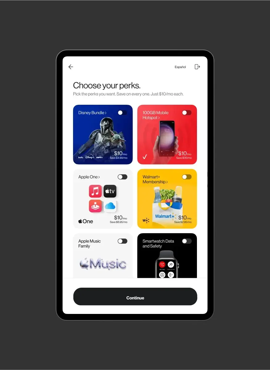
POS
Choosing the perks page
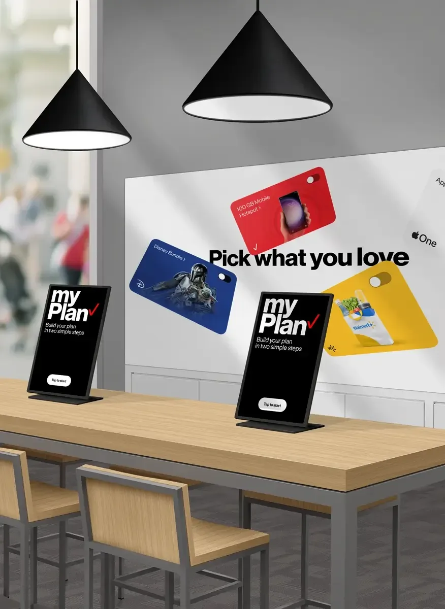
Official product render — Retail Companion in Verizon brand context
08 — Design System
VDS → RDS: Extending Monarch for retail.
Verizon's Monarch design system launched in 2024 governs all digital touchpoints. For RC we extended it into a Retail Design System — purpose-built for 15" touch, portrait layout, and high-ambient-light environments.
What is VDS / Monarch?
Verizon Design System (VDS/Monarch) governs typography, colour, components, motion, and accessibility across all digital touchpoints. For RC, I extended VDS into RDS — adapting all components for 15" touch, larger tap targets, high-ambient-light readability, and the portrait-vertical constraint unique to the kiosk.
Key extension: New kiosk-specific components — oversized plan cards, touch-optimised drawers, AI Quote display patterns, and idle timeout flow — all anchored to VDS tokens.
09 — Outcomes & Impact
What shipped. What changed.
Results from the 50-store US pilot — customer acceptance, rep efficiency, and business impact.
AI Recommendation Acceptance
Nearly double the 38% rep-verbal baseline. Contextual framing and transparent rationale were the decisive design decisions.
Plan Upgrade Completion
Increased 34% across pilot stores. Split-view plan comparison was the single highest-impact design decision.
NPS Improvement
Customers cited feeling "understood" and "not pressured" — exactly the design intent of Personal Shopper.
Projected Revenue Uplift
From the 50-store pilot, across the US retail footprint. Driven by upgrade completion, new lines, and VDP uptake.
Reflections
What I'd do differently. What I'd double down on.
🧠
AI trust is earned, not designed
The rationale card worked in testing but some users skipped it. I'd invest more in motion and progressive disclosure to slow the AI reveal — trust needs time to build.
🔄
The 180° UX needed more time
Dual-mode screen was right conceptually but the transition UX was underdesigned. I'd prototype the physical rotation interaction much earlier.
📐
RDS was the right call
Extending VDS into a retail-specific system paid off — component reuse was high and dev handoff was smoother. I'd formalise RDS as standalone governance from the start.
10 — Recognition
Recognised by Verizon leadership.
Two Certificates of Recognition from Jyotsna Malhotra, Associate Director – Experience Design, Customer Experience Organisation.



Aniruddha Garg
Senior Product Designer
(Design Ownership: Retail Companion)
7+ years across automotive HMI, retail UX, and enterprise product design. Previously Tata Elxsi (JLR, Mercedes-Benz) and Publicis Sapient (Verizon US). Currently at Škoda Auto Volkswagen India.