Jaguar Land Rover - EV Feature Spec
Industry
Automotive UX/ HMI
Client
Jaguar Land Rover
Service
UX Design
Date
Oct 2021 - Jan 2023
I was the design specification owner for the complete EV feature on this programme — Charging, Energy and Battery, every screen, every state and every page of documentation behind them.

Jaguar Land Rover · PIVI Pro Infotainment · 16:9 IVIEV &
Preconditioning
I was the specification owner for the complete EV feature on this programme — Charging, Energy and Battery, every screen, every state and every page of documentation behind them.
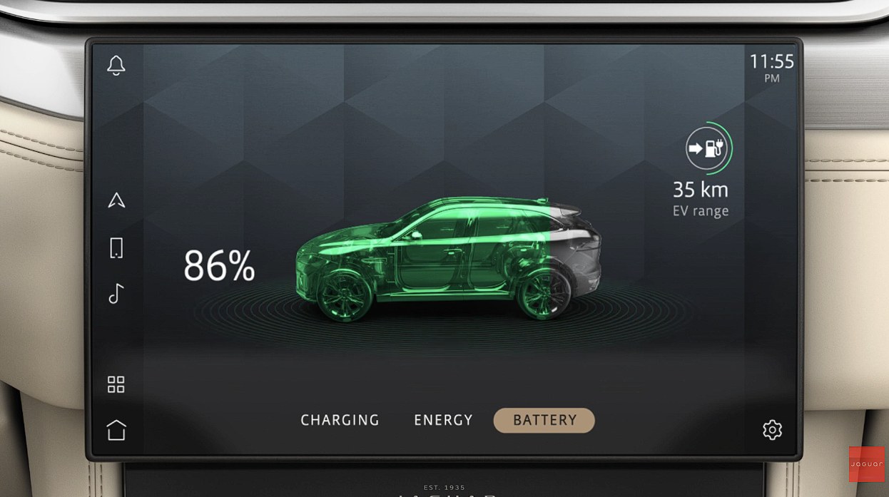
Battery tab · state of charge, EV range, charge status — 16:9 centre display
The constraints came first.
I worked inside JLR's Human Factors team, which changes where a design starts. Not "what should this look like" but "what is a driver allowed to do with this, at speed, with one hand, while the car is moving" — and only then, what it looks like.
Glance time
Every state resolves in under two glances, or it is redesigned.
Driver distraction
What is interactive in motion is a legal position, not a preference.
Switch-packs
Hardware and touch must agree on state, always.
Learnability
A driver learns the system once. New capability, no new grammar.
Feedback as safety
Feel that a press registered and you do not look twice.
System limits
Unbuildable is not a better design. It is a different project.

Features on a touchscreen in a driving environment have to be designed around safety, intuitiveness and easier learnability — with due consideration given to switch-packs, legal regulations and system limitations.— my working note from the programme
I wrote the driver-distraction rules this feature had to obey.
Inside JLR's Human Factors team my remit was not only to design EV, but to define the constraints any in-vehicle interaction on the programme had to satisfy — and then to hold my own feature to them. Those parameters are the reason the screens in this case study look the way they do:
- Text length per pop-up. A ceiling on how much copy an alert or confirmation may carry, set so it can be read in a glance rather than studied — and specified before translation, so it holds in every market language rather than only in English.
- Permitted media formats. Which content may appear on the centre display while the vehicle is in motion and which may not — the rule that decides whether something is shown, deferred, or suppressed until the car is stationary.
- Interaction cost. How many taps a task is allowed to take before it stops being acceptable at the wheel — the budget that forced recurrence into the calendar rather than leaving a driver to re-enter an event every night.
- Where voice does it better. Which tasks should leave the touchscreen altogether, because a spoken instruction costs no glance at all and a manual one always costs at least one.
- Steering wheel switches. The physical switch-pack mapping and what every press has to resolve to on screen — a feature I owned and specified in its own right, and the reason EV's controls behave consistently with the hardware around them.
Three decisions in this feature come straight out of those rules. State of charge is sized to be read from the passenger seat, because the most frequent question should be answered in the first glance and never need a second. The calendar exposes fifteen days rather than a month, because a grid that has to be scanned twice costs another look away from the road. And selected states that change nothing fire no haptic — the active footer tab, a toggle already on — because feedback that means nothing teaches a driver to stop trusting feedback that does.
Feedback is specified, not felt out.
Every calendar tile, footer item and toggle in this feature inherits a defined response model. Consistency here is a safety property: a driver who can feel that a press registered doesn't need to look twice.
| Interaction | Touch contact | Press contact "forced touch" | Release contact |
|---|---|---|---|
| Press | Visual | Visual / Audio / Haptic | Visual / Audio / Haptic |
| Press and hold | Visual | Visual / Audio / Haptic on secondary trigger | Visual / Audio / Haptic |
| Press and repeat | Visual | Visual / Audio / Haptic on repeat trigger | Visual |
| Swipe | N/A | N/A | N/A |
| Flick | N/A | N/A | N/A |
| Double tap | N/A | N/A | N/A |
| Pinch and zoom | N/A | N/A | N/A |
| Drag | Visual / Audio / Haptic | N/A | Visual |
| Drag and drop | Visual / Audio / Haptic | N/A | Visual |
Applied to this feature: date and weekday tiles are Press interactions; the multi-date drag inherits the Drag row — feedback on contact, visual only on release. Selected states that do not navigate — the active footer tab, a toggle already on — deliberately do not fire haptics, because nothing changed. Disabled states never do.
The complete EV feature — for PHEV and BEV.
EV answers three questions — when will it charge?, where is my energy going?, and how much have I got? Twenty-five specified areas sit behind them, and every state, disabled rule, fitment variant and line of copy across all three tabs was mine to define, defend and sign off.
- Tabs owned
- 3Charging · Energy · Battery
- Specified areas
- 25states, variants, copy, edge cases
- Handed to another owner
- 0requirements through release
- Features owned on the programme
- 4EV, Ambient Light, Eco Data, SWS
Charging
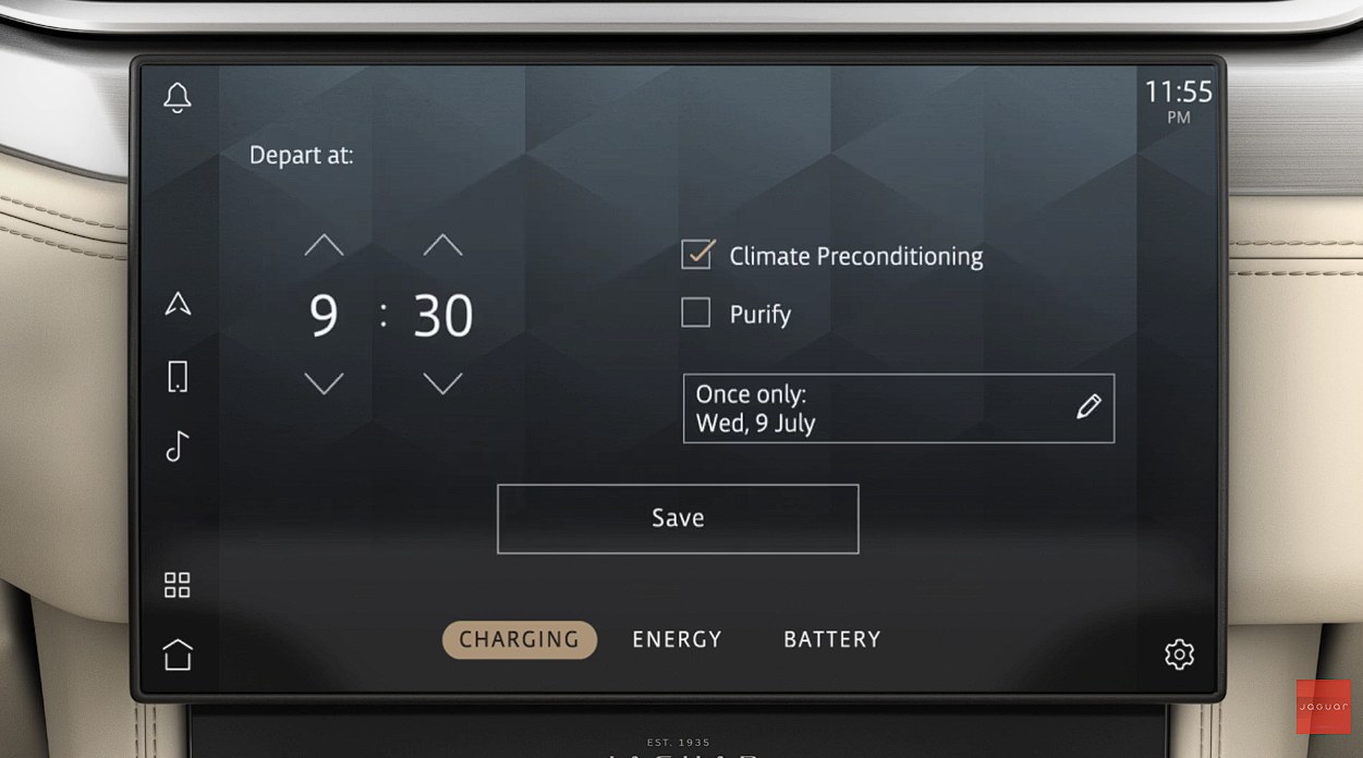
Scheduling. The driver picks a charging mode, sets a departure time, chooses whether the cabin should be conditioned to arrive comfortable, and decides when this should happen — once, or on a repeating pattern. Immediate charging, timed charging and preconditioning all resolve here.
- Charging mode — Immediate, Smart, or Low Cost Hours only, each with its own consequence explained in place.
- Depart at — a spinner timer in 5-minute increments, following the system clock's 12/24-hour format.
- Climate Preconditioning — pre-warms or pre-cools the cabin before departure, drawing from mains where possible.
- Purify / Deep Clean — a fitment-dependent option; shown only on vehicles with the cabin-air package.
- Event pattern — the dynamic control that opens the calendar. The heart of this case study.

Charging modes · Immediate · Smart · Low Cost Hours only
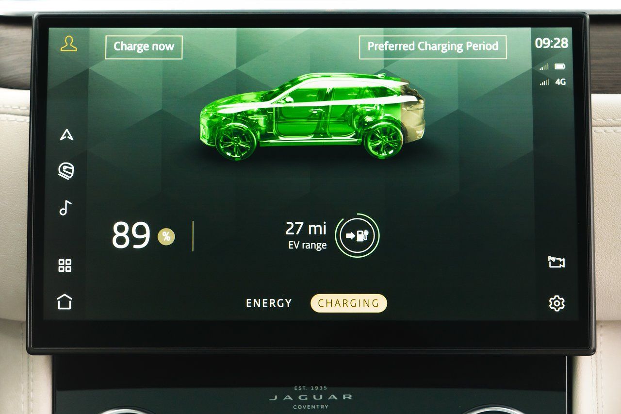
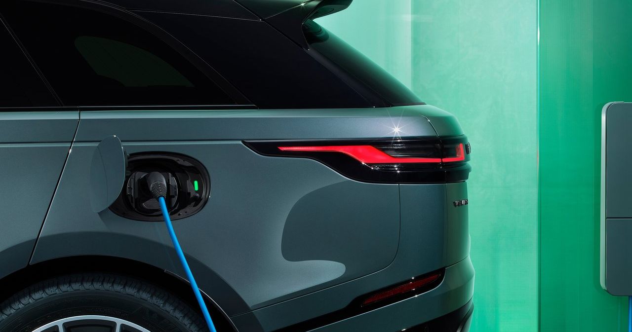
Charging tab in the cabin · Charge now · preferred charging period
Every area, and what each one had to define.
Nothing reached development until it was written down — every area needed a defined default, its empty and error states, its disabled rules, its fitment variants and its copy. Pick a tab, then an area.
end to end
across the feature
fully in Act II
to another owner
Charging mode
Three mutually exclusive modes, each carrying a plain-language sentence describing what the vehicle will actually do. The difference between them is money, so the explanation sits at the point of choice.
One number, then everything else
Charge leads, range supports. A driver asks "how full" before "how far".
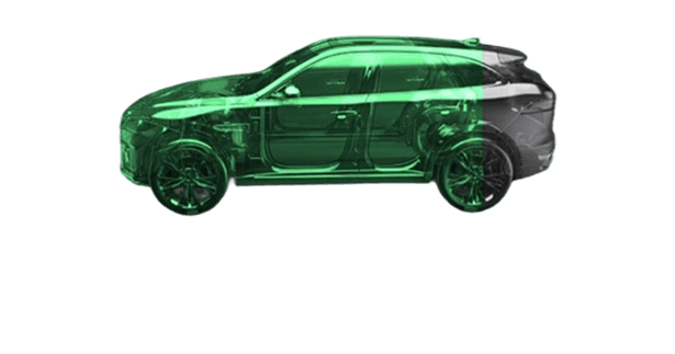
The car is the gauge
The silhouette fills as charge climbs. Form doing the work of a progress bar.
Modes explain their consequence
The difference is money and it's chosen once — so the explanation sits at the choice.

One grammar across three tabs
Same footer, same sidebars, same rules. Switching costs the driver nothing.
Fitment drives presence
Absent, not greyed. A dead control advertises what the customer can't buy.
Depth without navigation
Complex tasks open over the tab, never replace it. The IA stays three deep.
Tracked, argued, closed.
Tata Elxsi in Bangalore, JLR in the UK, suppliers elsewhere again. Agile, sprint-bound, and tracked in Jira — which means the design work was never a document handed over at the end. It was a queue of decisions, each one argued, specified and closed. Tap a ticket.
Ticket titles reflect real specified behaviour from this feature; identifiers are illustrative of the workflow, not a reproduction of the client's backlog.
Who the design had to collab with
The specification was the contract between all of these. Getting it wrong did not produce a bad screen — it produced three teams building three different things.
 Feature
specification
ownerEV & Preconditioning
Requirements in, decisions out
Each ticket arrived as a requirement or a defect and left as a specified behaviour — a numbered callout on a page, not a comment in a thread.
Three time zones
Reviews with the UK, build with development, alignment with system engineers — usually not in the same working day. Written specification is what made that survivable.
Deprecation stays visible
Removed behaviour is struck through in-page with its ticket reference rather than deleted, so the next person can see what was tried and why it went.
On an OEM programme the specification is the product.
Engineering builds from it, the text team translates from it, QA tests against it. Owning the EV specification meant every state, every disabled button and every fitment variant across all three tabs was mine to define and defend.
Requirements & benchmarking
Gathered system and user requirements, benchmarked competitor EV scheduling experiences, and mapped what was technically reachable within the existing platform.
Interaction concepts
Conceptualised feature interactions from first principles — flows, wireframes, information architecture and prototypes for review.
Edge-case definition
Anticipated the scenarios nobody asks for: past times, partial selections, discarded sessions, fitment differences, clock-format changes.
Cross-functional alignment
Worked with system engineers, visual design, content/language, PO and development to build consensus and keep one interpretation of the design alive across three time zones.
Specification authoring
Authored every numbered, annotated EV spec page development builds from — including deprecation history and fitment conditions.
Review, sign-off, support
Ran stakeholder reviews, secured sign-off, then supported development and visual design throughout the build and into release.
Six artefact types, repeated for every area of the feature map.



The document is
the deliverable.
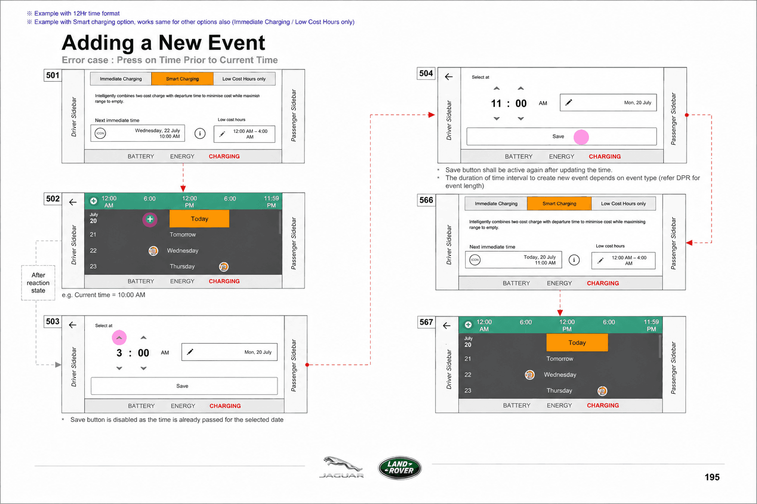
Not a prototype, not a Figma link — a numbered, versioned document that development builds from, QA tests against and the language team translates from. I authored the EV specification in full. The index below is what that covered.
Numbered callouts
Every interactive element on a page carries a number, and every number carries a rule — including what happens when it is disabled, absent or inherited from the system.
Fitment variants in-page
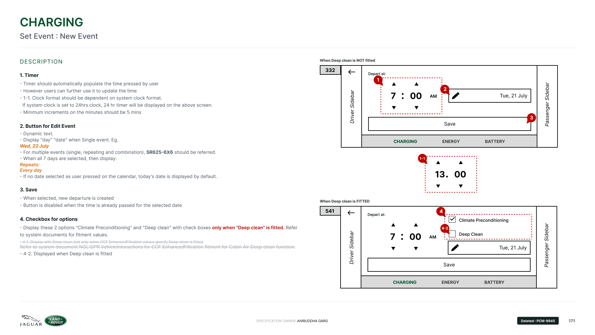
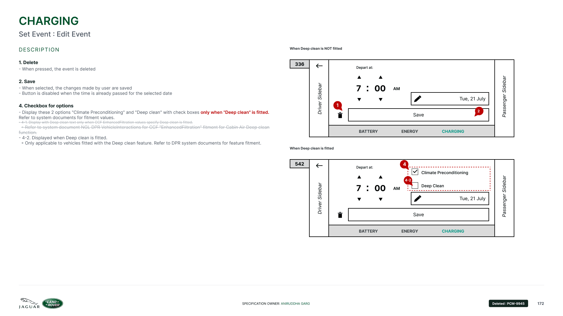
Where a vehicle option changes the screen, both versions are drawn on the same sheet rather than described in prose. Development never has to imagine the other one.
History, not deletion
Superseded behaviour is struck through with its ticket reference. The reasoning survives the change, which is what makes the document usable a year later.

A charging schedule is a promise the car makes about tomorrow morning.
Timed charging · preconditioning · departureThe same depth,
on one of the twenty-five.
Charging → Set Event → Repeat event. Two rows of the index above, five pages of the same document. A feature is only ever proved by how one part of it was actually resolved — so what follows takes the timed-charging calendar from pain point to production, at the depth everything else in EV was worked at.
The calendar knew
exactly one word:
a date.
The existing experience let the driver pick a single day — and nothing else. There was no way to say every Monday, no way to say weekdays, and certainly no way to say weekdays, plus this Saturday. Recurrence simply did not exist in the model.
- One single date per event — the entire vocabulary
- No repeating rule of any kind: no weekday, no weekly, no daily
- A five-day routine meant five separate events, or nightly re-entry
- No way to make an exception, because there was nothing to except
- Summary text only ever had one shape to describe
- Every downstream screen assumed a single date object
Thu, 23 Jul
The hard part was never the grid. It was everything downstream of the grid.
Seven screens from the home tile to a saved departure.
The calendar doesn't exist in isolation — it sits at the end of a path the driver takes while the car is plugged in on a driveway. Specifying it meant specifying everything either side of it too. Step through the flow.
Use the arrow keys, or tap a step
Four live tile states,
one composable grammar.
The whole solution rests on giving a date tile more than a binary. A tile can be selected in its own right, or selected as a consequence of the weekday column above it — and those two things must look different, because tapping them does different things.
Deselected
Normal state. Tapping selects the date directly and fills the tile.
Selected
Filled. An explicit, one-off date chosen by the driver. Tapping again deselects it.
Weekday selected
The column header. Selecting it makes the event repeat on that weekday and marks every date beneath it.
Child of a repeat
Outlined, gold text. Selected because its column is. Tapping it collapses the repeat to that one date.
Unavailable
Beyond the 15-day selectable window, or already past. Not interactive.
15 days forward
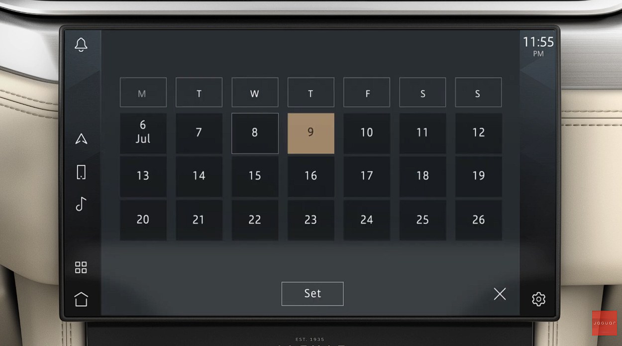
The mini calendar exposes the next 15 days from the current day as selectable. Long enough for a fortnight's routine, short enough that the grid stays scannable at a glance.
Combination is the point
Weekday selection, single-date selection, drag-selection and deselection are designed to be used together — that combination is what makes the experience better, not any one mechanism alone.
Month carries over
The current date and any month boundary are abbreviated in place — 20 Jul, 1 Aug — so a fortnight crossing a month never needs a second view.
The calendar, running.
A faithful reconstruction of the specified behaviour. Tap a weekday header to make the event repeat. Tap dates to add one-offs — or drag across a run of them to take several at once. Tap a gold child date to collapse its repeat down to that single day.
Tap · or drag across dates to select a run
Nothing selected — today’s date is used by default.
Committed state · nothing saved yet
OK commits, ✕ discards
Changes made during a session only persist if OK is pressed. Closing the overlay any other way throws the session away — a deliberate safety valve for a screen used at a glance.
Drag is additive, not destructive
A drag only adds or clears one-off dates; it never creates or removes a weekday rule. Rules stay deliberate, set from the column header, so a stray swipe can't rewrite a routine.
Save can refuse
Wind the departure time back past the current hour with today selected and Save greys out. An event that has already passed cannot be created — the control refuses rather than explaining.
Six selections.
Six ways of saying it.
The grid was only half the work. A composable selection produces a compound meaning, and one small two-line control on the Set Event screen has to express all of it — in every market language, without wrapping.
Mon, Tue
+ 2 more
+ 1 more
+ Every Sat
+ more
The rule, in one line: the label leads with whatever happens next.
Not what the driver tapped first — what the car will do first. A schedule is read forwards.
If the next occurrence is a repeating weekday, the extra dates are counted — “+ 1 more”.
If the next occurrence is a one-off date and a single weekday rule follows it, that rule is named — “+ Every Sat”.
Anything more compound than that resolves to “+ more”, because a two-line control is not a sentence.
All seven weekdays collapse to “Repeats: Every day”.
The edge cases are the design.
Every scenario below started as an argument — with a system engineer, the PO, or the platform itself. Resolving them in the specification is what stopped them being resolved by accident in code. Pick one.
Save is disabled, not error-toasted
Prevent the unreachable state instead of explaining it after the fact. A driver who can’t press the button never has to read why.
What actually
ships.
Not a Dribbble shot — numbered pages in a document that a development team in another country builds from without asking a follow-up question. I authored the EV specification in full; these two pages are the calendar's.


- Charging
- Modes, timers, preconditioning, calendar, notifications
- Energy
- Consumption, eco data, range projection
- Battery
- State of charge, EV range, charge status
- Across all three
- Sidebars, footer, overlays, fitment variants
Timer
Auto-populates the time the user pressed. 5-minute minimum increments. Clock format inherits the system clock — a 24-hour system renders 13:00, not 1:00 PM.
Edit Event button
Dynamic text, driven by the language strategy above. Single event shows day and date; repeats show the weekday list; all seven collapses to Repeats: Every day.
Delete
Only present when editing an existing event. Create and edit share one screen and one mental model; the destructive action is the single addition.
Option checkboxes
Climate Preconditioning is always present. Deep Clean appears only where the cabin-air package is fitted, per DPR system fitment values.
What changed for the driver.
Measured the way an interaction designer measures: in what the driver has to do, what they have to learn, and what they can finally say.
Schedule shapes the driver can express. One before; six after — once only, repeating week, multiple dates, and three ways of combining them.
New interaction patterns introduced. Weekday headers, tiles and drag all reuse grammar already present elsewhere in Pivi.
Screens added to the IVI. The entire capability landed inside one existing feature overlay.
Note on figures: shape counts, label states, tile states and the selectable window are taken directly from the specification. Event and action counts are task-flow comparisons — modelled from the old and new flows rather than measured from instrumented field data — and are presented as such, not as research findings.
Rendered in the car.
The specified behaviour, rendered by the visual design team and running on the 16:9 centre display.

Four features, same depth of ownership.
EV was one of four features I specified end to end on Pivi Pro — requirements through specification, sign-off and release support, with no handover in between.
Bravo Award, for consistently delivering high-quality work to tight deadlines across this programme.
Features specified end to end on Pivi Pro — EV & Preconditioning, Eco Data, Ambient Light and Steering Wheel Switches.
Owner from requirements through concept, specification, sign-off, build support and release — no handover, no reinterpretation.
A feature development could build without asking
The value of a specification owner is measured in questions that never get raised. States, fitment variants, disabled rules and copy were resolved on the page, in advance, across three time zones.
Capability grew, complexity didn't
EV gained recurring schedules, combination events and mode-level control without adding a screen to the IVI or a pattern for the driver to learn.
Other features I specified on this programme.
Same role, same depth of ownership — requirements through specification, sign-off and release support.
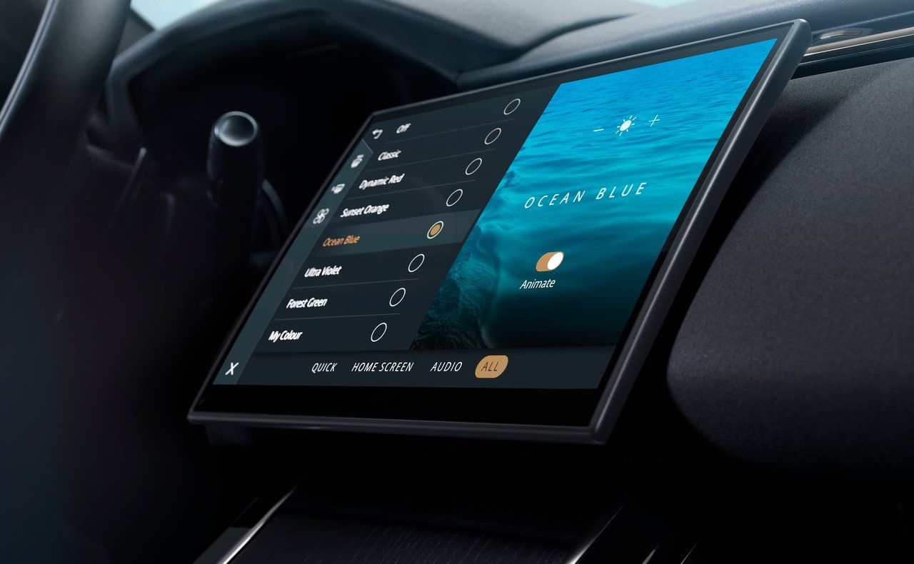
Ambient Light
Cabin lighting themes, colour selection and animation behaviour across the interior.
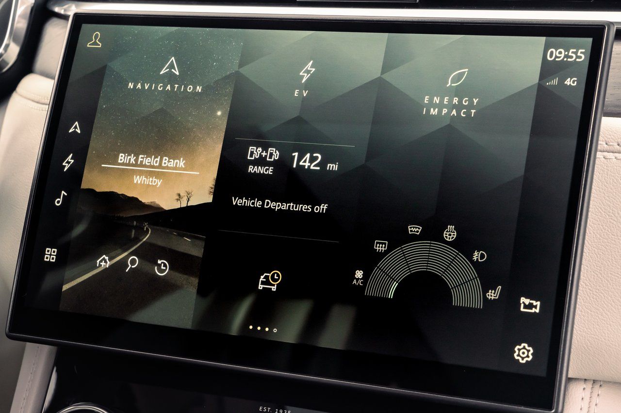
Eco Data
Consumption and efficiency reporting — making driving behaviour legible without lecturing.
Steering Wheel Switches
Physical switch-pack mapping and the on-screen behaviour every press has to resolve to.